The 1980s were the decade when album covers became statements in their own right.
Advances in graphic design, photography and print coincided with the rise of artists who understood the power of imagery, with many signalling shifts in artistic direction or making bold statements matched by the artwork on the cover.
From post-punk austerity and techno-futurism to pop art pastiche, these covers helped define how the music of the era was seen as well as heard. Here, we rank the very best 1980s album covers, from great to truly iconic.
Best 1980s album covers
35. U2: The Joshua Tree (1987)
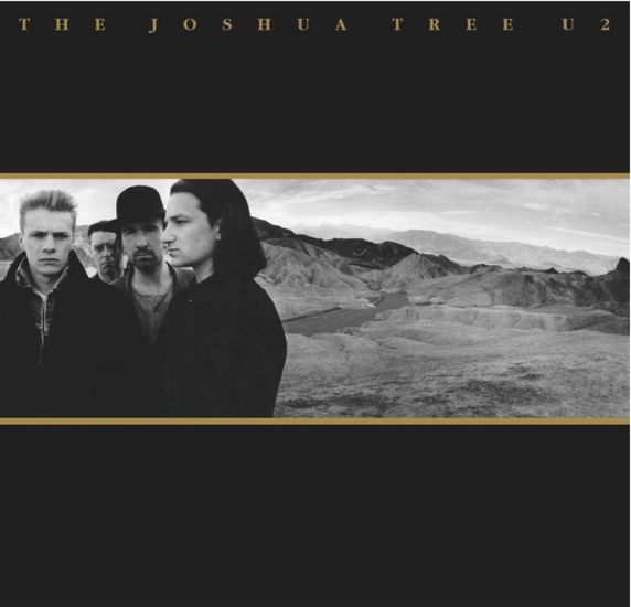
Anton Corbijn’s stark, widescreen photography gave U2 a visual identity as grand and windswept as the music itself. Shot in the Mojave Desert, the cover’s monochrome palette and vast horizon evoke American myth, spiritual searching and emotional scale. It’s austere, iconic and perfectly aligned with the band’s shift into monumental, arena‑sized ambition. One of the decade’s most elegant, enduring images.
34. Iron Maiden: Powerslave (1984)
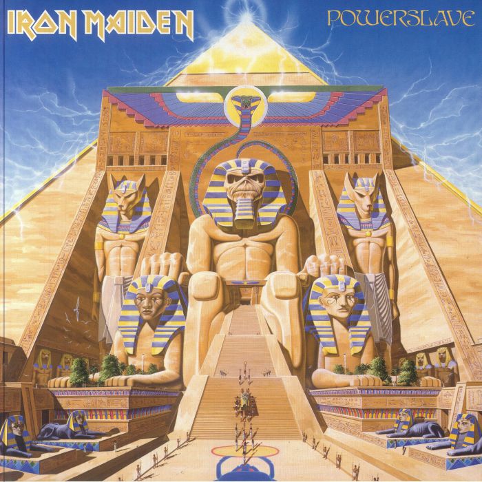
Maiden’s mascot Eddie becomes a colossal pharaoh on one of metal’s most elaborate covers. The towering, hyper‑detailed Egyptian temple – complete with hieroglyphic gags and sci‑fi flourishes – is a triumph of fantasy illustration. It captures the band’s theatrical scale and world‑building ambition at their commercial peak. In the ’80s metal landscape, Powerslave wasn’t just an album; it was an entire universe rendered in artwork.
33. Metallica: Master of Puppets (1986)
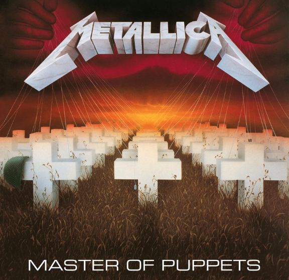
The cemetery field of white crosses tethered to strings is brilliantly eye-catching, with the strings connected to a pair of hands in a blood-red sky, the crosses contrasting dramatically with the bright orange sunset. Designed by Metallica and their manager Peter Mensch, the artwork was painted by American painter Don Brautigam using airbrush and paintbrush to create a dreamlike, hyperreal image.
Drummer Lars Ulrich has described the image’s reference to the album’s idea of people – such as soldiers in Disposable Heroes – being subconsciously manipulated, an overarching theme of the record.
We named Metallica as one of the 11 bands who faced tragedy – and then came storming back.
32. Dire Straits: Brothers in Arms (1985)
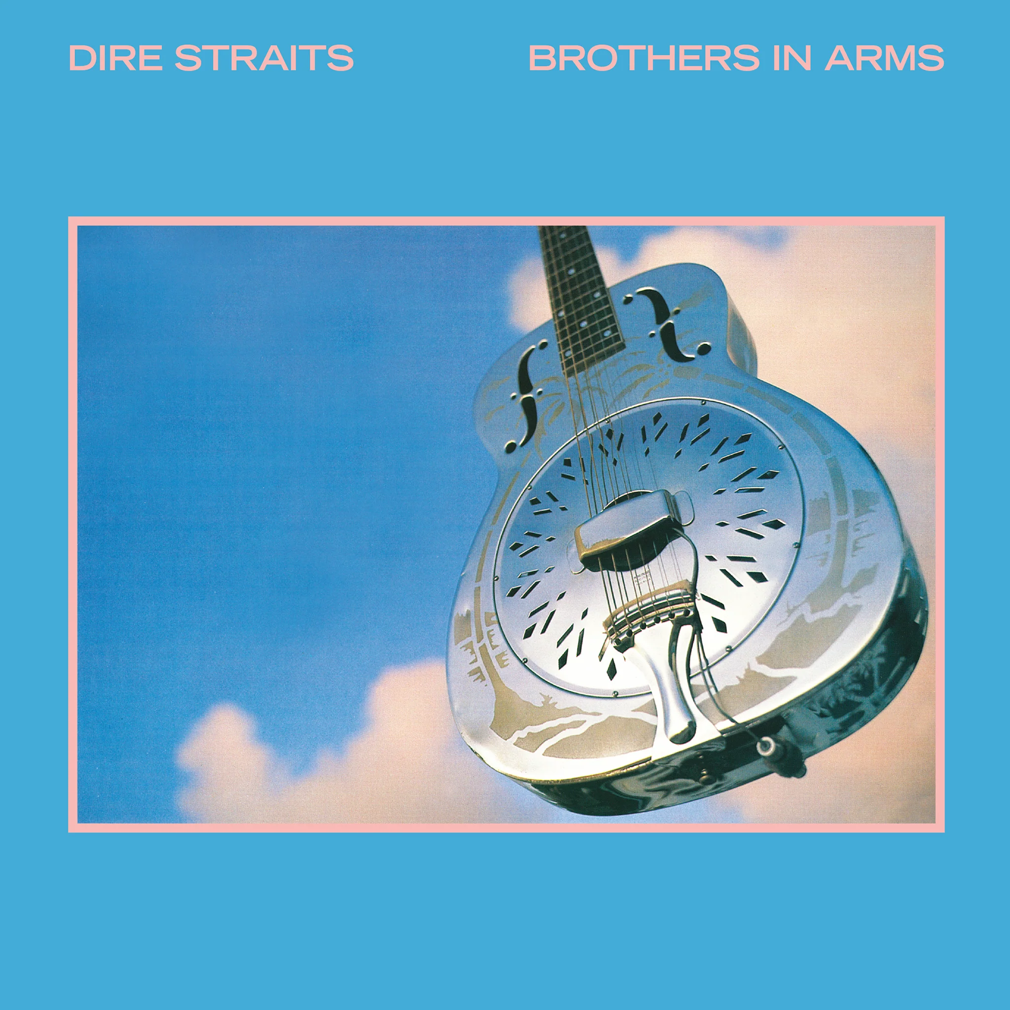
The resonator guitar floating against a serene, cloud‑washed sky is a masterclass in simplicity. It’s iconic because it feels mythic: the instrument becomes a kind of emblem, suspended in space like a relic or a promise. The soft pastel palette and clean composition give the cover a calm, timeless quality that contrasts beautifully with the album’s widescreen rock. It’s one of the decade’s most quietly powerful images.
31. Peter Gabriel: IV (Melt) (1980)
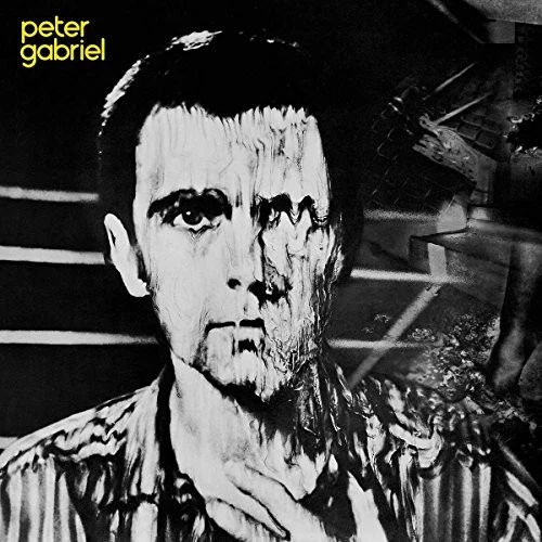
The distorted, melting portrait – created through experimental Polaroid manipulation – is one of the most striking pieces of early‑’80s art‑rock imagery. It’s unsettling, surreal and instantly memorable, capturing Gabriel’s fascination with identity, fragmentation and psychological unease.
At a time when most covers leaned towards polish, Melt embraced the uncanny, helping define Gabriel’s post‑Genesis persona as an artist pushing visual and sonic boundaries simultaneously.
30. Kraftwerk: Computer World (1981)
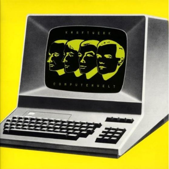
In another technology-inspired artwork, the eighth studio album by German electronic band Kraftwerk references the hit single ‘Computer Love’. The album is themed around burgeoning computer technology developments and their rise within society. Despite the topics at the heart of the album, however, the production was entirely analogue and didn’t involve any computers.
The album sleeve shows a computer (a Hazeltine 1500 smart terminal – a late-1970s device that was popular among early adopters of the microcomputer) displaying the heads of four band members as robotic mannequins.
29. Depeche Mode: Music for the Masses (1987)

The loudspeaker motif – stark, industrial, pointed at an empty horizon – is one of Depeche Mode’s most enduring visual statements. It’s a perfect metaphor for the band’s late‑’80s identity: minimalist, modern, and quietly confrontational.
The muted colour palette and clean composition give the cover a utilitarian feel, as if it’s broadcasting a message rather than selling a record. It’s iconic because it captures the moment when Depeche Mode shifted from cult electronic act to stadium‑filling force, turning a simple symbol into a piece of era‑defining design.
28. The Cure: Disintegration (1989)
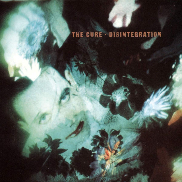
The blurred, dreamlike collage of flowers and Robert Smith’s face is one of the most atmospheric covers of the decade. It mirrors the album’s emotional landscape: romantic, gothic, and dissolving at the edges. The washed‑out colours and soft focus create a sense of melancholy drift, as if the image itself is fading. It’s iconic because it perfectly encapsulates The Cure’s late‑’80s aesthetic – lush, introspective and grandly sorrowful – and has become visual shorthand for the band’s most celebrated era.
27. Yellow Magic Orchestra: X∞Multiplies (1980)
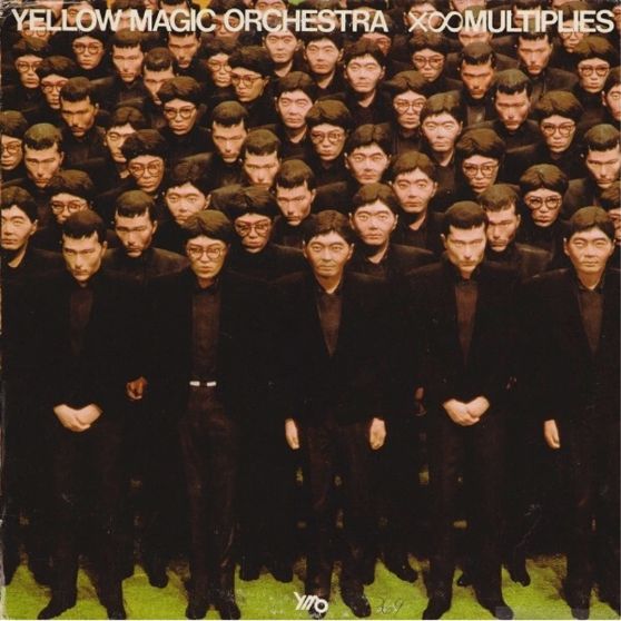
In a different approach to mannequin motifs, the futuristic electronic image on Yellow Magic Orchestra’s 1980 album was art directed by Takahisa Kamijyo. Android dummies are seen dressed in black, with the real band members – Haruomi Hosono, Ryuichi Sakamoto and Yukihiro Takahashi – featuring on the back cover.
26. Bauhaus: The Sky's Gone Out (1982)
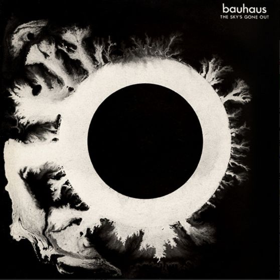
This cover speaks to the band’s gothic influences, showing what appears to be a looming black hole. The dark image and gloomy sound proliferate through the music of Bauhaus, who often defaulted to black-and-white covers. The artwork was painted by Daniel Ash, guitarist and Bauhaus founding member.
25. Alice Cooper: Raise Your Fist And Yell (1987)
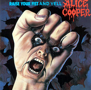
A true love-it-or-hate-it-cover.
The American artist Jim Warren is best known for his surrealistic fantasy art, and the cover of Alice Cooper’s Raise Your Fist And Yell is a classic blend of horror and surrealism using traditional oil on canvas. The unsettling image shows a clenched fist with a screaming face. The band name is also displayed in a font that appears to be written in bright red, dripping blood, tapping perfectly into the heavy metal aesthetic.
24. Tears for Fears: Songs from the Big Chair (1985)

The close, monochrome portrait of Roland Orzabal and Curt Smith is intimate, calm and quietly confident. No flashy graphics, no ’80s neon – just two faces presented with understated clarity.
That simplicity mirrors the album’s emotional directness and polished sophistication. It’s iconic because it rejects the era’s visual clutter, opting instead for a timeless, human image that lets the music’s depth speak for itself.
23. Kate Bush: Hounds of Love (1985)

The soft, dreamlike photograph of Bush wrapped in lilac fabric is deceptively simple, but it became one of the decade’s most evocative images. It captures the album’s blend of intimacy and theatricality – part romantic, part otherworldly.
The muted colours and gentle composition give it a timeless, almost painterly quality. It’s iconic because it feels like an invitation into Bush’s imaginative world, perfectly mirroring the music’s emotional sweep.
22. New Order: Power, Corruption & Lies (1983)
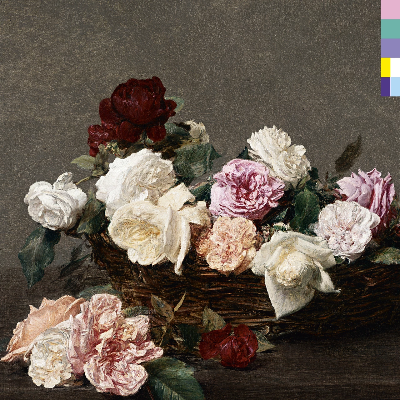
Peter Saville’s decision to pair a classical still‑life painting with a modern colour‑code system created one of the decade’s most striking juxtapositions. The floral image is soft and romantic; the coded bar is cold, cryptic and futuristic.
That tension mirrors New Order’s blend of melancholy and machine‑driven electronics. It’s an album cover that feels both timeless and avant‑garde – a perfect visual expression of early‑’80s post‑modern design.
21. The Smiths: The Queen Is Dead (1986)
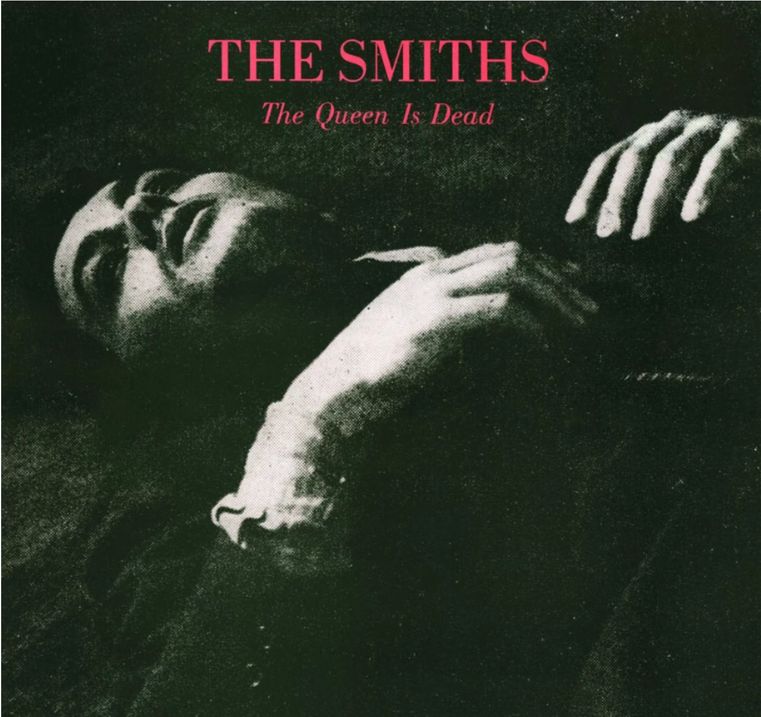
The cover of The Smiths’ third studio album is a still of the French actor Alain Delon from the 1964 film, The Unvanquished. The band often featured actors on their album covers, with James Dean and Richard Bradford appearing on the sleeves of Big Mouth Strikes Again and Panic respectively. The arresting image of Delon is taken from the film’s final scene, where his character lies dying on the floor.
We named this album's successor Strangeways, Here We Come as one of the best farewell albums of all time – released soon after the band had announced their shock split.
20. U2: War (1983)
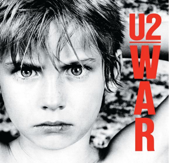
U2’s first overtly political album, War includes songs such as ‘Sunday Bloody Sunday’ and ‘New Year’s Day’, referencing the Troubles in Northern Ireland and the Polish Solidarity movement respectively. Bono told the NME at the time: ‘War seemed to be the motif for 1982. Everywhere you looked, from the Falklands to the Middle East and South Africa, there was war. By calling the album War we’re giving people a slap in the face.’
Instead of depicting the brutality of war, U2 decided to put the face of a child on the cover – a young boy, Peter Rowen, the brother of Bono’s friend. He also appears on the covers of several other U2 albums and singles.
19. The Stone Roses: The Stone Roses (1989)
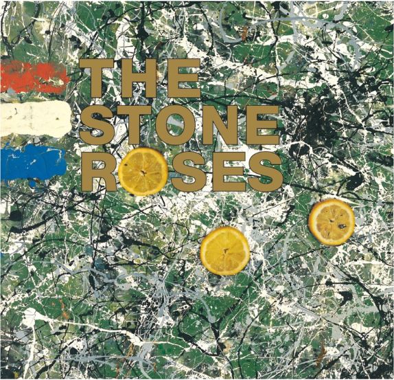
As with most Stone Roses releases, the cover of the band’s self-titled debut album was designed by guitarist John Squire. Its title, Bye Bye Badman, is taken from one of the album’s tracks, the lyrics of which were inspired by the May 1968 Paris riots. Released towards the tail end of the decade in May 1989, the album and its artwork alludes to this leftist student revolt that nearly led to the demise of the French government.
The pattern in the painting is said to be inspired by the band’s trip to the Giant’s Causeway in Northern Ireland. The colours of the French flag are also visible, another hat-tip to the Paris riots.
Did you know: The lemon slice that forms the ‘o’ in ‘Roses’ is a reference to the use of lemons as a tear gas remedy during the 1968 riots.
We named The Stone Roses' debut as one of the best first albums of all time.
18. R.E.M.: Murmur (1983)
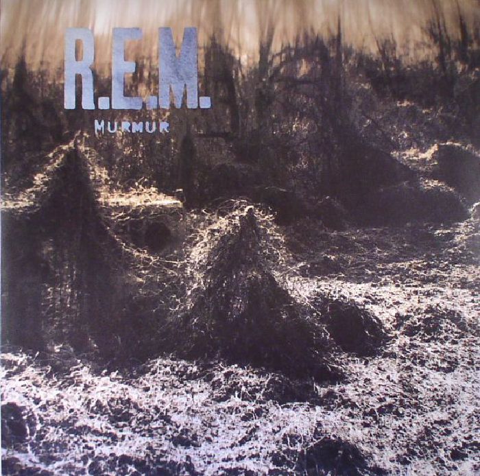
The blurred kudzu landscape is one of the great anti‑rock‑star statements of the decade. No band photo, no logo dominance, no attempt at myth‑making – just a strange, overgrown, slightly haunted image that perfectly matches the album’s murky, enigmatic sound. In an era obsessed with gloss, Murmur’s cover felt defiantly out of time, helping cement R.E.M.’s identity as the mysterious outsiders of early ’80s American rock.
17. Madonna: Like a Virgin (1984)
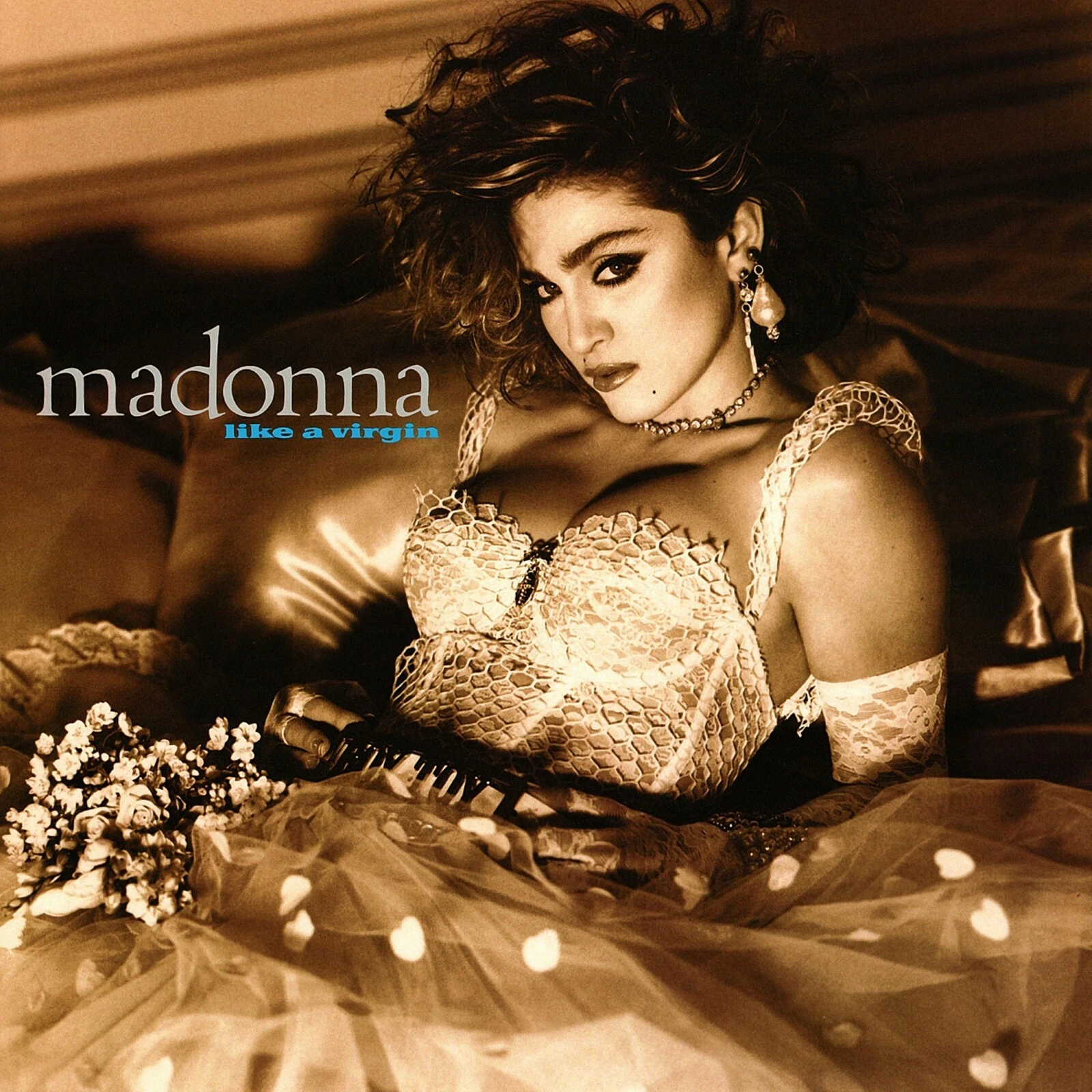
This was the album cover that crystallised Madonna’s emerging persona: provocative, glamorous and entirely in control. Shot by Steven Meisel, the bridal‑dress imagery is both playful and confrontational, turning innocence into performance.
The soft lighting and luxe styling give it a high‑fashion sheen that set her apart from other pop acts of the era. It’s a cover that announced Madonna not just as a star, but as a master of visual storytelling – someone who understood the power of image as deeply as the music itself.
16. The Human League: Dare (1981)
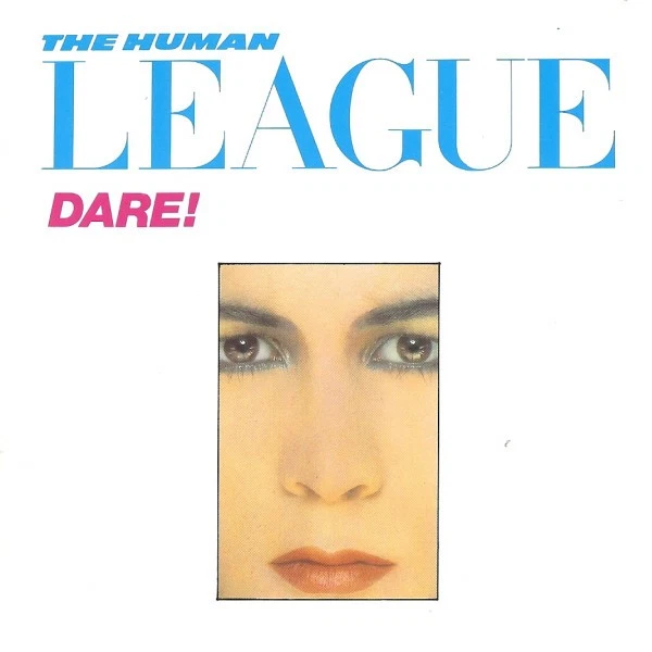
The Dare cover is a perfect example of early‑’80s graphic minimalism. Its icy portraiture, clean typography and stark white space present the band as sleek, modern and emotionally distant – exactly the aesthetic that defined synth‑pop’s rise.
The image feels more like a fashion editorial than a rock sleeve, signalling a shift towards style‑driven pop identity. It’s iconic because it captured the moment when electronic music became aspirational, cool and sharply designed, helping cement Dare as one of the decade’s defining visual statements.
15. Beastie Boys: Licensed to Ill (1986)
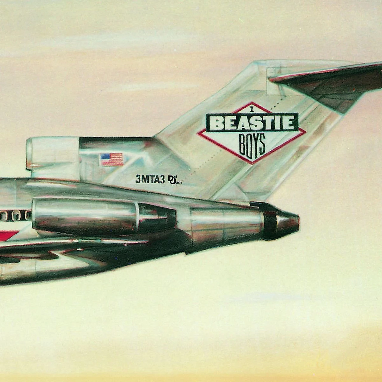
The crashed plane – complete with hidden '3MTA3' gag on the tail, 'meaning 'EAT Me' when seen in a mirror – is one of hip‑hop’s most memorable visual jokes. It’s brash, irreverent and slightly absurd, perfectly matching the Beastie Boys’ chaotic, party‑driven energy.
The bold illustration gives the cover a comic‑book swagger, while the concept itself feels like a parody of rock‑star excess. In a decade full of polished imagery, Licensed to Ill stood out by being loud, funny and deliberately juvenile, becoming an instantly recognisable emblem of mid‑’80s hip‑hop attitude.
14. Pixies: Surfer Rosa (1988)
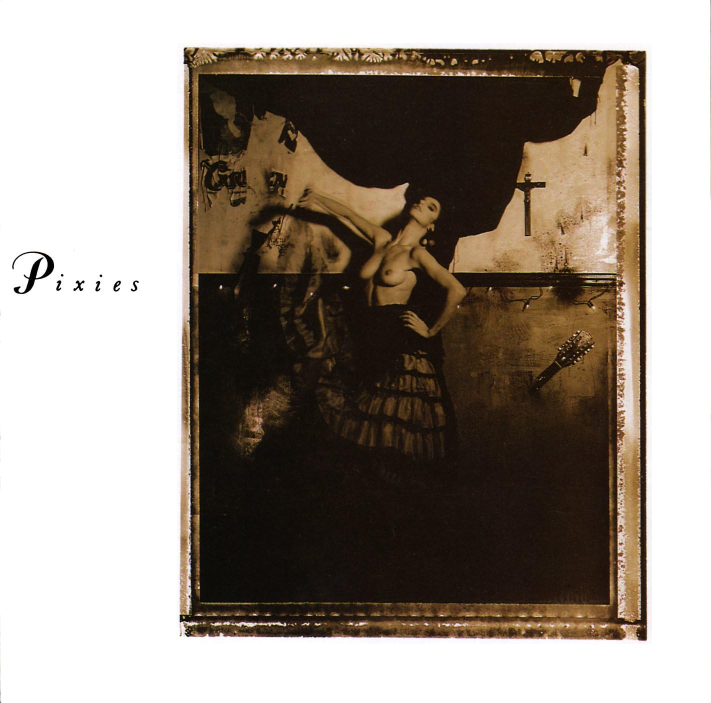
The stark, unsettling photograph of a topless flamenco dancer is both confrontational and oddly poetic – a jolt of raw, art‑house energy that mirrors the album’s abrasive beauty. Its grainy, sepia tone and off‑centre composition feel deliberately unpolished, rejecting mainstream aesthetics in favour of something stranger and more primal.
It’s one of indie rock’s most instantly recognisable images, perfectly aligned with the band’s fractured, explosive sound.
13. Echo & the Bunnymen: Ocean Rain (1984)
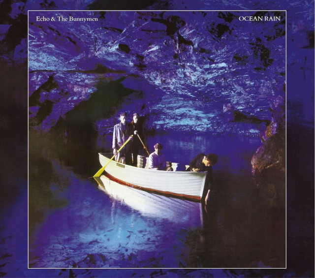
The band photographed in a cobalt‑blue boat inside a vast, shadowy cave is one of the most atmospheric images of the decade. It’s theatrical without being bombastic, mysterious without being contrived.
The deep blues and cavernous space echo the album’s lush, romantic sweep, giving Ocean Rain a visual identity as grand and moody as the music itself. It’s an ’80s cover that feels like a dream you can step into.
12. AC/DC: Back in Black (1980)
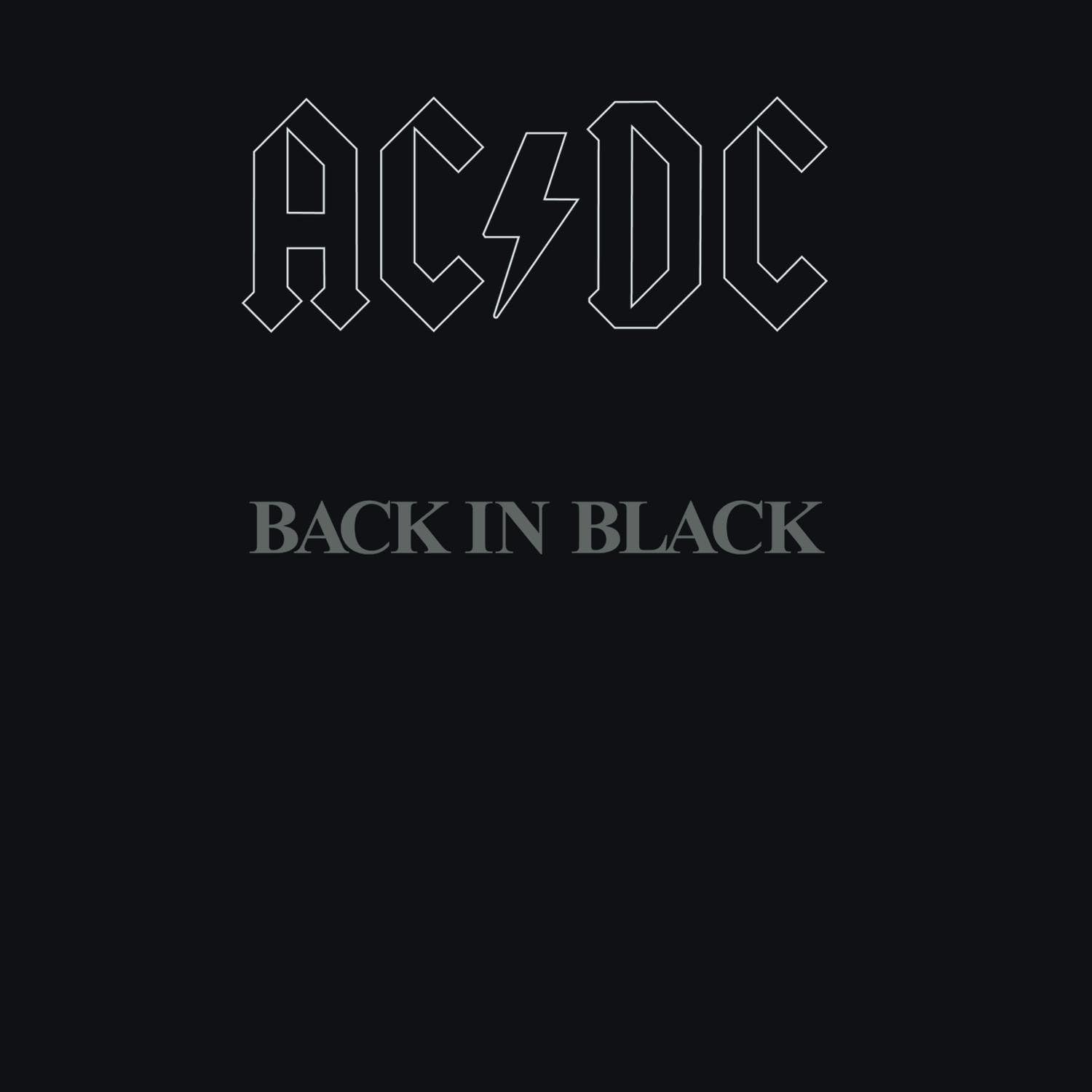
Few covers say so much with so little. The stark black sleeve, broken only by the band’s logo in muted silver, is a monument to restraint – a visual act of mourning after Bon Scott’s death and a declaration of strength. Its minimalism became iconic precisely because it refused spectacle. In a decade of excess, Back in Black stood out by being almost entirely empty, and that emptiness became its power.
11. Public Enemy: It Takes a Nation of Millions to Hold Us Back (1988)
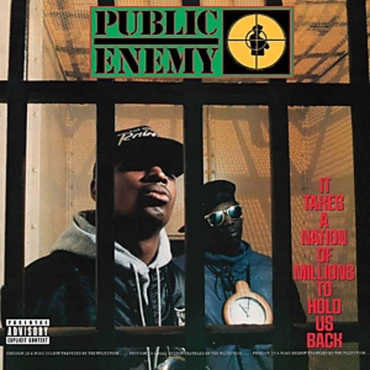
The cover’s power lies in its blunt, confrontational symbolism. Shot by Glen E. Friedman, the image places Chuck D and Flavor Flav behind the bars of a prison gate – not as inmates, but as commentators staring directly at the system.
The composition is tight, claustrophobic, and deliberately unglamorous, rejecting the glossy aesthetics dominating late‑’80s hip‑hop. The crosshairs logo reinforces the group’s militant stance, turning the artwork into a visual manifesto about surveillance, oppression and resistance.
It’s iconic because it matches the album’s urgency: a stark, street‑level photograph that feels like reportage rather than promotion, perfectly aligned with Public Enemy’s mission to expose and challenge the structures holding people back.
10. Van Halen: 1984 (1984)
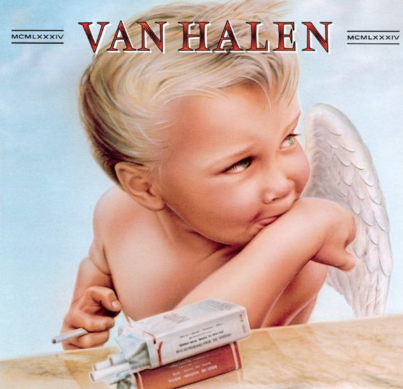
Painted by graphic artist Margo Nahas, Van Halen’s 1984 cover depicts a putto (a chubby, winged child figure from classical art – the secular equivalent of a cherub) smoking a cigarette. Nahas featured the child of one of her best friends as the model of the putto, photographed holding a candy cigarette, which she then edited to include the cigarette packet.
The cover was actually censored in the UK at the time of release, with a sticker added to all albums obscuring the cigarette and packet. Baby imagery went on to be used on major rock releases, memorably on Nirvana’s Nevermind album, which depicts a naked swimming baby chasing a dollar bill.
We named Van Halen as one of the messiest band breakups of all time – and one of the worst bands to be in.
9. Talking Heads: Remain In Light (1980)
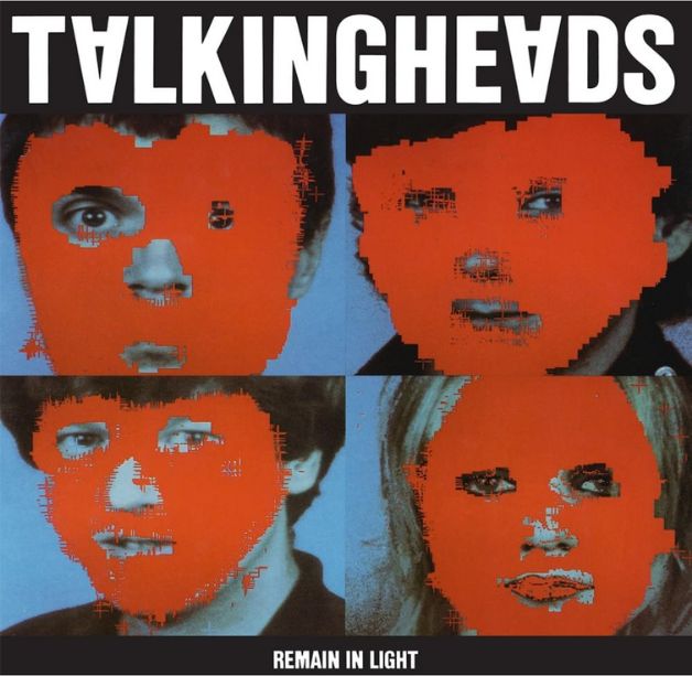
In one of the first computer-designed album covers, the artwork for Talking Heads’ Remain In Light was originally planned for the album’s back sleeve – but got promoted to the lead image.
The bold and simple design presents four portraits covered by red blocks of colour, and was designed by bassist Tina Weymouth and drummer Chris Frantz with aid of the Massachusetts Institute of Technology, and design company M&Co. The simple font inverts the As, a unique typographical approach for this album.
We named the Talking Heads film Stop Making Sense as one of the greatest rock movies of all time.
8. The Police: Ghost In The Machine (1981)
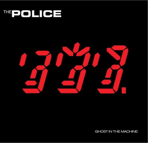
Released in 1981, the cover of The Police's fourth studio album resembles a retro red LED calculator display. Each figure reflects the characteristics of the band’s three members with their distinctive hairstyles. The figure of Andy Summers is on the left, with Sting in the middle sporting spiky hair, and Stewart Copeland on the right with a fringe.
7. Sonic Youth: Daydream Nation (1988)
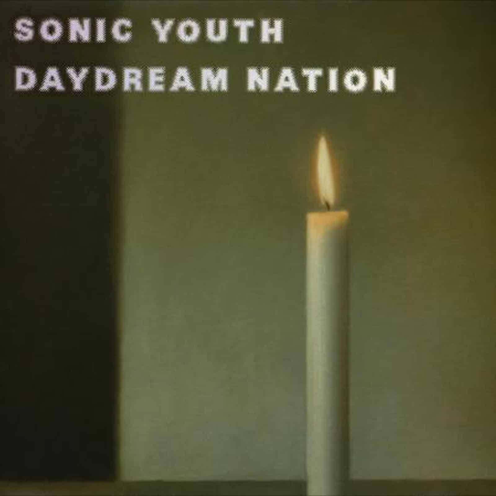
The candle photograph is deceptively simple – a single flame against a muted background – but it became one of indie rock’s defining images. Borrowed from a Gerhard Richter painting, it captures the album’s mood perfectly: cool, minimal, quietly intense.
In an era of neon excess, Sonic Youth chose restraint, and that stark, contemplative cover became a visual shorthand for late‑’80s alternative culture.
6. Joy Division: Closer (1980)

Joy Division's second and final album was recorded in March 1980 – and released by Factory Records several months later, following the death of lead singer Ian Curtis. The band subsequently reformed as New Order, but this album was released posthumously – a particularly poignant mirroring of the album’s despair as Joy Division mourned their bandmate.
The cover is more poignant still: a striking black-and-white photo of the Appiani family tomb in Genoa’s Monumental Cemetery, depicting the figures of Mary and Jesus. In his autobiography Record Play Pause, drummer Stephen Morris wrote of the cover: ‘The photography seemed either like an eerie prophecy or some bad taste, cash-in joke. Who in their right mind would put a tomb on the front of an album by a band whose singer had just died?’
In fact, the album artwork had been created and approved by the band before Curtis’s death. The record was actually delayed in its release, due to mishaps at Factory Records. It was simply a case of melancholic coincidence.
5. Prince: Purple Rain (1984)
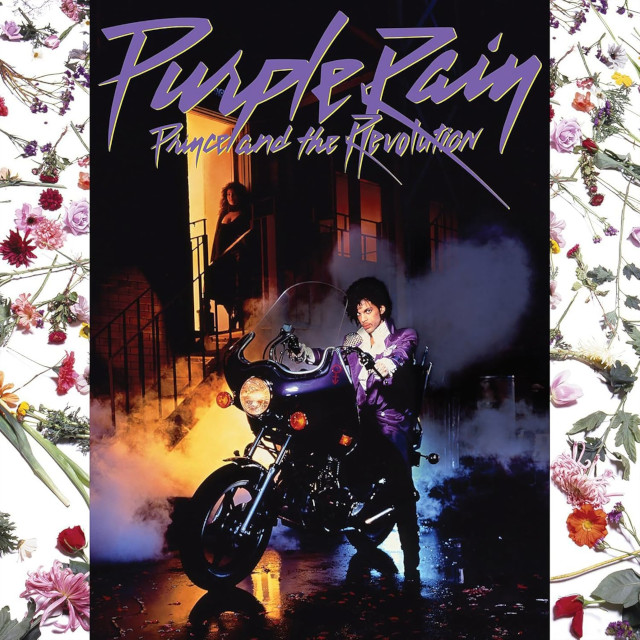
Few covers scream 'iconic' as loudly as Prince astride his purple motorcycle, bathed in theatrical smoke and neon glow. It’s pure myth‑making: flamboyant, mysterious, and instantly recognisable. The image crystallised Prince’s persona – part rock star, part pop auteur, part cinematic presence – and helped turn Purple Rain into a cultural phenomenon. It’s not just an album cover; it’s a piece of pop history.
4. Grace Jones: Island Life (1985)
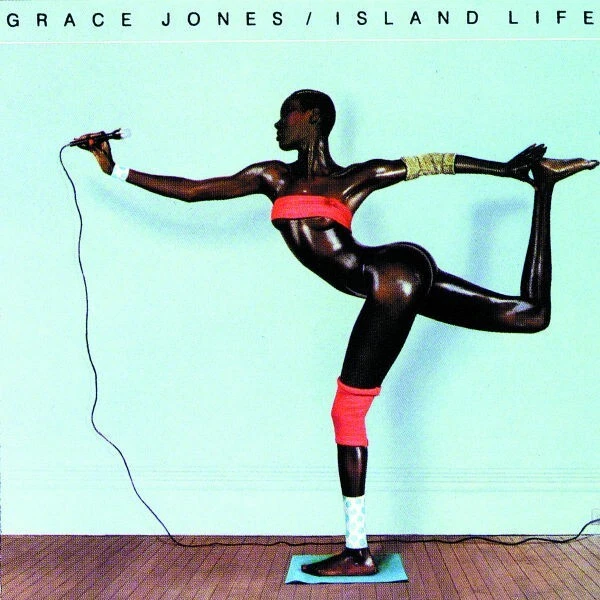
All Grace Jones’s album covers see her in striking poses, but none more so than the image chosen to adorn the cover of her 1985 compilation album Island Life. An oiled Jones is shown performing a graceful arabesque – but music lovers might be surprised to learn that it is not a single image. Photographer Jean-Paul Goude created the image using his cut-and-paint technique on a series of shots cut together.
3. The Clash: London Calling (1980)
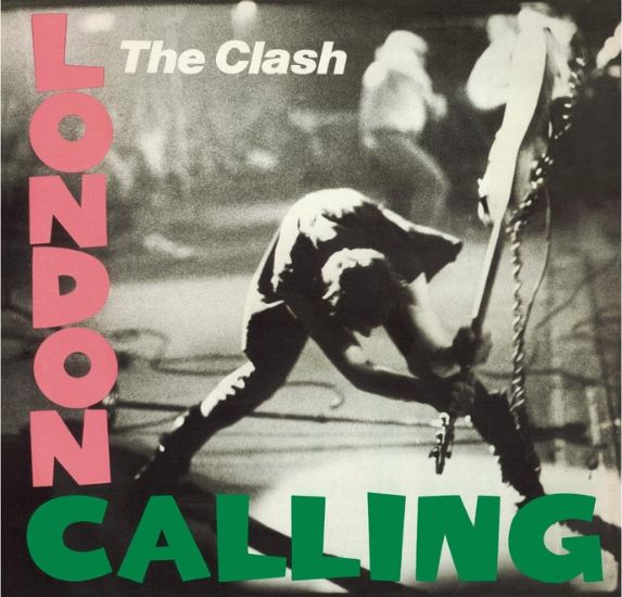
The Clash’s bassist Paul Simonon is shown smashing his Fender Precision Bass against the stage of the Palladium in New York City in 1979. Simonon had taken to breaking his guitar after frustrations that the bouncers weren’t allowing audience members to stand up out of their seats.
Photographer Pennie Smith took the photo, but didn’t actually want it to be used on the cover of London Calling, as she believed it to be too out of focus. The rest of the album cover design was a homage to Elvis Presley’s self-titled debut album released in 1956, with the same pink and green lettering.
The artwork has enjoyed life beyond The Clash, with Banksy referencing the image in a London work, showing an office chair being smashed in place of the guitar.
We named The Clash's 'Hitsville UK' as one of the worst songs by rock legends.
2. Bruce Springsteen: Born in the U.S.A. (1984)
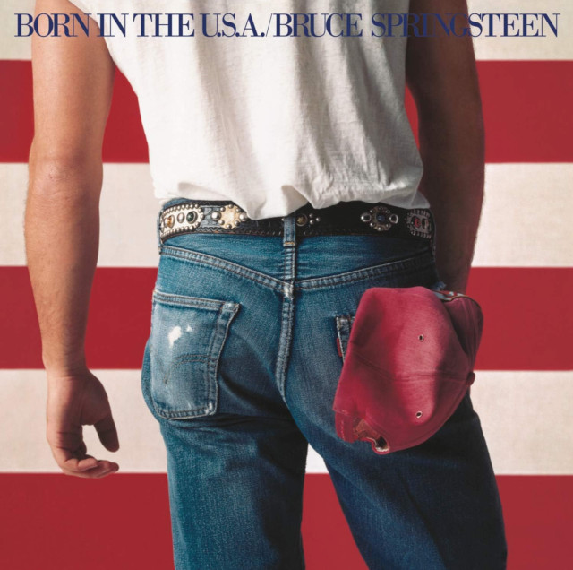
It’s an American classic – but the Born in the U.S.A. cover wasn’t loved by everyone.
In fact, its photographer Annie Leibovitz wasn’t a fan. She felt the final image reduced her nuanced, politically charged shoot to a simplistic, flag‑waving visual that didn’t reflect the complexity she intended. That misunderstanding mirrors the song itself, widely taken as patriotic when it’s actually a critique of how America treats its veterans.
The artwork shows Bruce Springsteen against the U.S. flag, dressed in an iconic white T‑shirt and jeans, with a red baseball cap tucked into his back pocket – a cap with sentimental value, belonging to the recently deceased father of his friend Larce Larson.
1. Michael Jackson: Thriller (1982)
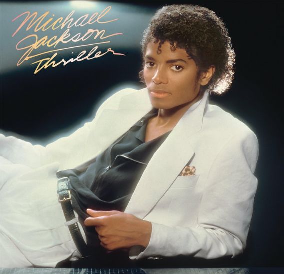
Iconic – because it captures Michael Jackson at the exact moment he became the defining pop figure of the decade. The white suit, the relaxed pose and the soft, cinematic lighting create an image of effortless glamour – polished but not over‑styled. It’s a portrait that radiates confidence and modernity, perfectly aligned with the album’s crossover ambition. In the visual language of the ’80s, this is pure myth‑making: a star presenting himself as both approachable and untouchable.