
There was a time in the not so distant past when buying an album on impulse was a thing. In the days before the price of a new album became prohibitive, the album sleeve could be the defining factor between an album being put back in the rack or taken home in a plastic carrier bag.
First and foremost, the album sleeve needed to grab the attention of the buyer. This lead to album sleeves becoming more and more fantastical, and with such ambition there are always stories to tell.
Here are 11 album sleeves with a story.
11 album sleeves that tell a story
11. Crosby, Stills and Nash – Crosby, Stills and Nash (1969)
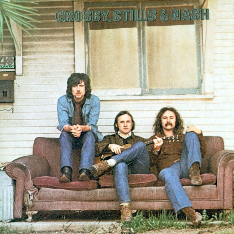
The newly formed vocal trio went out in West Hollywood on a photo shoot with legendary snapper Henry Diltz with the intention of grabbing an image for a potential album sleeve. They came across an abandoned shack with a beaten up sofa outside and posed for the shot.
On reflection, the three of them realized that the shot they gained was the inverse of the band name order, Nash, Stills and Crosby. In order to remedy the situation Diltz and the three cover stars reconvened in the exact same location a couple of days later, only to discover the shack had been demolished.
10. The Beatles – Help! (1965)
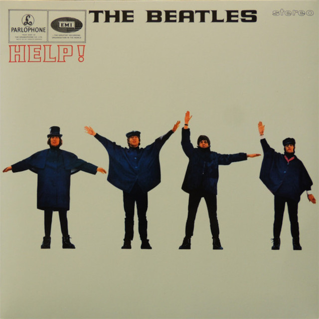
Semaphore is a communications system where a person holds two flags in different positions to represent letters, it is often used at sea. The original intention for the image that adorns The Beatles’ second soundtrack album was for John, Paul, George and Ringo to spell out the word ‘H-E-L-P’ in semaphore.
The reality of the situation was that the correct arm positions looked wrong in terms of aesthetics. The photographer instructed the four of them make different shapes that better suited the shot.
The end result was an album sleeve that spelt out the letters, N-U-J-P. Paul was later inspired to write the classic track ‘With A Little NUJP From My Friends’.
9. Black Sabbath – Paranoid (1970)
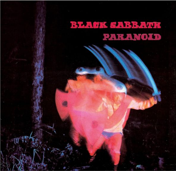
The front sleeve of Black Sabbath’s Paranoid features the blurred image of a man in a crash helmet jumping out from behind a tree brandishing a sword and shield. The connection between the image and the album title isn’t immediately self-evident, and the reason for that is there isn’t one.
Sabbath’s second album was originally going to be called ‘War Pigs’ but was changed last minute when the record company got cold feet because of the Vietnam War. The title was changed to the name of the band’s breakthrough single, but the artwork stayed exactly the same.
8. David Bowie – Diamond Dogs (1974)
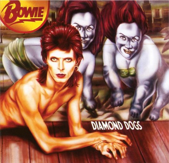
The original concept for what ended up as the Diamond Dogs album was a rock opera adaptation of George Orwell’s 1984. This plan was abandoned when Orwell’s widow refused to allow David Bowie the rights to use her late husband’s work. From there the album morphed into a dystopian tale of Bowie’s telling.
The cover features a painting by Belgian artist Guy Peellaert depicting Bowie as a half-man, half-dog figure. The image caused huge controversy on release, as the canine genitalia were on display for all to see. The record label was quick to airbrush out the offending parts on subsequent releases.
Peellaert also contributed the artwork for The Rolling Stones’ It’s Only Rock ’n’ Roll.
7. The Who – Who's Next (1971)
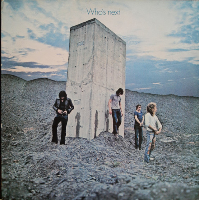
The iconic image on the cover of The Who’s fifth studio album shows the band adjusting their flies after having just urinated on a concrete pillar protruding from a slag heap. The concept was meant to loosely reflect the obelisk that magically appears in Stanley Kubrick’s 2001: A Space Odyssey.
Legend has it that only Pete Townshend was able to pee on command and that the other ‘splashes’ were created by using rainwater tipped from an empty film canister. Over the passage of time, the pillar has subsequently been buried, nonetheless, it is marked on Google Maps as the ‘Who’s Next Monolith.’
6. Dexys Midnight Runners – Searching For The Young Soul Rebels (1980)
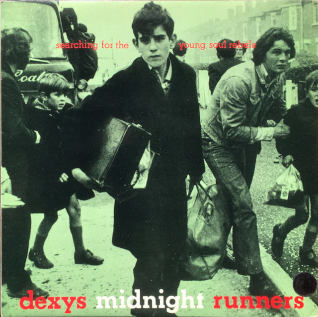
The cover of Dexys’ barnstorming debut album features an impactful image of a young Catholic boy being forced from his home in Belfast due to the introduction of internment in 1971. Kevin Rowland choose the image because he felt it connected closely with his band’s defiant spirit.
Many years later, Anthony O’Shaughnessy, the young lad in the photo, completed the circle by turning up to a show in Brighton for a chat. Rumour has it Anthony also turned up for a Dexys’ gig with a large cardboard cut out of himself tucked under his arm.
And who can forget the wonderful 'Geno':
5. Talking Heads – Remain In Light (1980)
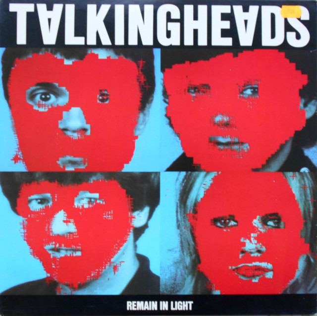
The working title for Talking Heads’ fourth studio album was ‘Melody Attack’, and it was with this concept in mind that band members Tina Weymouth and Chris Frantz set out to design the artwork. An image of torpedo bombers flying over a mountain range was conceived for the front cover with a series of band portraits designated for the back.
In the meantime, the album title was reassessed and deemed too flippant when compared to the gravity of the music they were creating. Plan B was quickly adopted and the placement of the images were switched.
The cover portraits feature digitally manipulated blocks of red slapped over the band members faces. It is one of the earliest examples of digital artwork to feature on a cover and was created using a huge mainframe computer belonging to the Massachusetts Institute of Technology.
4. The Rolling Stones – Some Girls (1977)
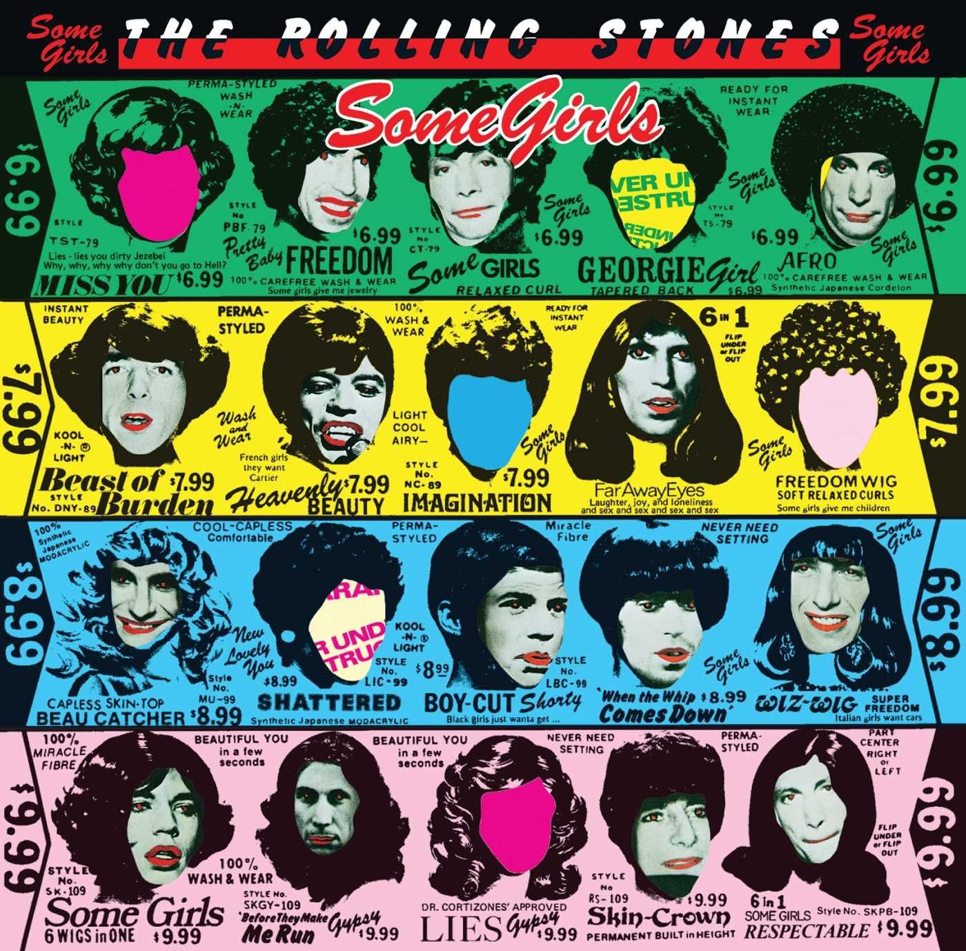
Released during the height of punk rock, Some Girls proved that The Rolling Stones were still relevant, but only just… The album sleeve was an elaborate die-cut design featuring windows that aligned with the inner sleeve to display head shots of the band in drag alongside images of female celebrities, such as Raquel Welch, Lucille Ball and Marilyn Monroe.
The only problem being that none of the celebrities gave their advance permission to use their image. The threat of legal action forced the record label to halt production and conjure up some alternative artwork.
The solution was simply to block out the images and include the phrase, ‘Pardon our appearance - cover under construction’. A third iteration appeared with extra images of the band in make-up.
3. Durutti Column – The Return Of The Durutti Column (1980)
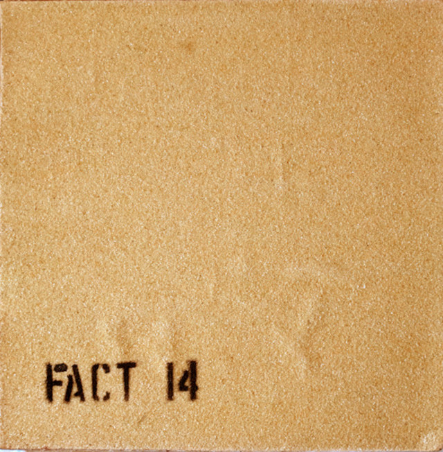
A situationist statement designed to destroy the other records filed next to it, The Durutti Column’s 1980 debut album was released with two sheets of sandpaper stuck to its sleeve, with some copies sprayed with ‘FACT 14’.
Under label boss Tony Wilson’s tutelage, band members from Joy Division and A Certain Ratio were reportedly paid £15 each and given a pile of 4,000 sheets of sandpaper. The story goes that Ian Curtis took on the bulk of the work while his bandmates watched a dirty movie in an adjacent room.
2. Echo and The Bunnymen – Porcupine (1983)
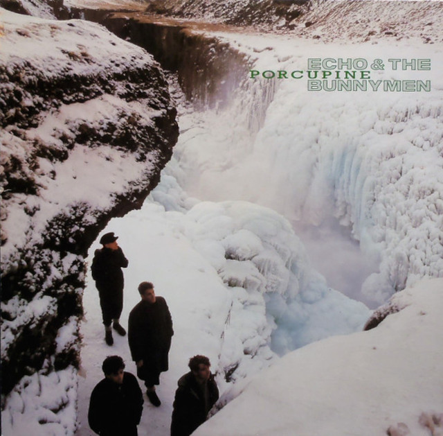
Hoping to reflect the icy feel of the music created on their difficult-to-make third album, Echo and The Bunnymen were set to travel to Scotland to shoot the album cover. A lack a snow in the Highlands caused a rethink and Iceland was chosen as a last minute alternative. The shoot took place by a frozen waterfall just outside of Reykjavik.
Not ones for duck down jackets, fleeces or sensible footwear, the band wore their trademark trench coats and nearly froze to death. Ian McCulloch was wearing a pair of impossibly impractical shoes made out of felt throughout the shoot. One slip would have meant the band needing to look for another singer.
1. Debbie Harry – KooKoo (1981)
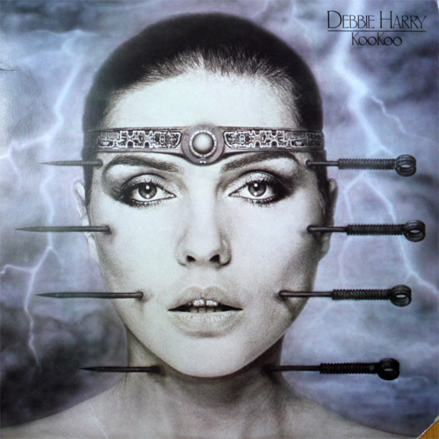
Fresh off the back of his success with Alien, Swiss artist HR Giger was approached by Chris Stein and Debbie Harry about designing the sleeve for Harry’s debut solo album. Giger had recently undergone acupuncture, and drew inspiration from the process. “The idea of the four needles came to me, in which I saw symbols of the four elements, to be combined with her face,” he said.
The band approved and travelled to stay at his house in Zurich. Giger had to make a separate cast of each half of Harry’s face because of her claustrophobia. The response to the controversial cover wasn’t universally positive, and it was banned from adverts on the London Underground transport.
Here's the sassy 'Backfired':
Album covers Discogs


